
October 1, 2015
Is Cover Art Worth A Thousand Words?
Recently, it has come to light that the e-book revolution may not be all it was cracked up to be. Readers are downloading titles, but they still predominantly buy and read print copies.
We also know that indie bookstores are, by and large, doing well. Plugged into their communities, they’ve been able to thrive in many places even as the big box book guys have declined and shuttered stores.
Why?
One reason is that books themselves matter to people. The tangible, sensory experience of picking one up, feeling its weight, taking in the cover.
Art matters when you’re trying to attract readers. You can have a brilliant novel, memoir or cookbook sitting right in front of you, but if its package isn’t appealing, you could easily miss it.
Pixels vs. Pages: E-Books Take A Hit – The Kojo Nnamdi Show
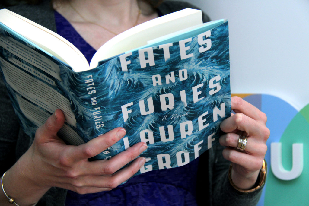
So Chris, Jonathan and I took some time to consider what kind of cover art makes us want to pick up a book. And we brought in a ringer, Helen Yentus. She’s the art director at Riverhead Books, the publisher behind “Fates and Furies” whose work is garnering lots of attention in the world of books.
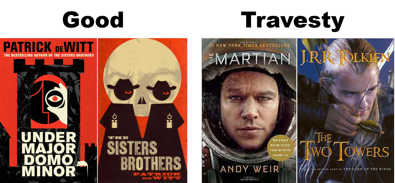
The three of us have strong feelings about what makes a good cover too. Chris in particular expressed a distaste for movie tie-ins. Symbolic and stylized covers, like the ones on Patrick deWitt’s work? Good. Covers featuring actual people, especially Hollywood actors? Bad.
Tell us what appeals to you on covers, and what makes you roll your eyes and walk away.
Listen to our conversation above and post your comments here –or tell us in person at our book club! It’s free to attend, but do RSVP so we know you’re coming.